3 winning A/B tests B2B software sites must try

June 24, 2014

As we’ve studied and delved deeper into conversion path optimization for B2B software and tools, we’ve noticed as an agency that there are a handful of areas always worth testing.

In this post I’ll discuss the art of testing into a more effective value statement, how to toy with guarantees and find one that’s appropriate, and what makes a badass signup form that mints money.

These aren’t sure to work for everyone, but they are A/BRead more…

Read more...

As we’ve studied and delved deeper into conversion path optimization for B2B software and tools, we’ve noticed as an agency that there are a handful of areas always worth testing.

In this post I’ll discuss the art of testing into a more effective value statement, how to toy with guarantees and find one that’s appropriate, and what makes a badass signup form that mints money.

These aren’t sure to work for everyone, but they are A/B test ideas that we’ve seen win nicely for B2B software companies, which just might make them worth trying.

1. Can we pack more value into a headline? Websites (and landing pages) often have a key value statement. If someone drops by and reads nothing more, at least they’ll read this. We’ve found it useful to ask: can the value statement communicate more benefit than it does now?

We ran a test to this end on CleverZebo.com and here’s what we learned.

There were three variants:

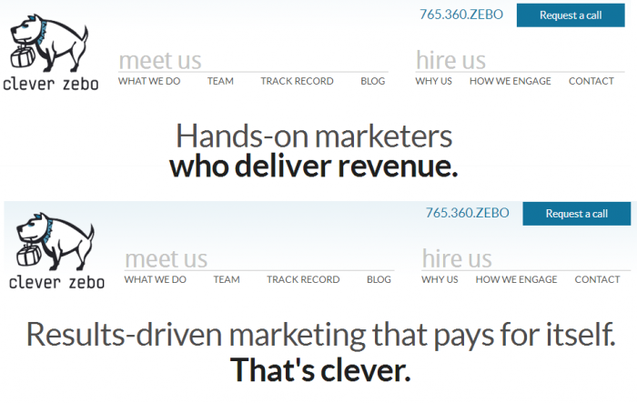
  • Hands-on marketers who deliver revenue. (Original)
  • Results-driven marketing that pays for itself. That’s clever. (Variant A)
  • Results-driven marketing that pays for itself. (Variant B)

When you consider the original headline on top, against the winning headline beneath it, there are a few considerations.

Clever Zebo homepage A/B test

Delivering revenue sounds good to a business owner, but getting results and paying for yourself — being ROI positive as a vendor — is much better.

“Hands-on” describes us as roll-up-your-sleeves marketers who take on real projects, but “Results-driven” goes deeper than that. It tells the business owner not to take our word for it that we’re doing lots of work, but instead to hold us accountable for results.

Flipping your value statement is always a strong A/B test, especially when you think through the benefits packed into it from the perspective of your customer.

2. Can we offer a powerful guarantee? Retailers tend to offer guarantees, whether it’s a price match or an assurance of quality. Why don’t B2B software companies do the same?

There are a few elements worth testing here:

  • Image / guarantee badge
  • Guarantee messaging
  • What happens if the guarantee is not met

If you don’t have a designer on hand who can whip up a killer badge for your guarantee A/B test, here is a good resource for decent badges that are free to use.

Our friends at Crazy Egg recently published a useful post on creative and rarely used guarantees that may be worth A/B testing.

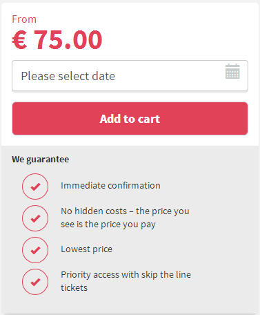
Here’s a guarantee used by Musement.com, an international travel and tour booking site.

Guarantee for A/B testing


The strengths of this guarantee are that it re-emphasizes the benefits of working with them, it builds trust with the “lowest price” promise and it’s specific about what you can expect.

It would be worth investigating whether these promises can be neatly shoehorned into a beautiful badge, and whether conversions rise if the visitor is told what happens if the guarantee is not met.

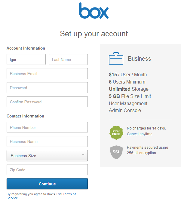
3. Can we offer more & ask for less in our signup form? Your signup form is important for capturing data, but it’s also a sales opportunity. On the signup page, you’ve yet to close the deal. Instead, it’s a critical phase where you must continue to shine. Check out how Box.com addresses this problem.

Box signup form

They collect a lot of fields, but they also build confidence through the “risk free” badge and the assurance of security and encryption. They also remind you what you’re signing up for: a business account with 5 users, unlimited users and more. They confirm the price on this screen. This is clean and clear-cut.

Box teaches us to test selling alongside the signup process, but also to keep that sale professional, useful and relevant. There’s no marketing-speak. It’s just the benefits listed as fact.

The other testing opportunity this example recalls is an obvious one: can we collect fewer fields and still accommodate the visitor? In many cases, requiring fewer fields has proven to convert better. So what’s most essential?

I once introduced a 2-field signup form solution to a fast-growing B2B software company. That shrank the signup process down from 6 fields and was highly controversial, but when it finally went live, it improved conversion rate by close to 50%. The lesson there isn’t just that you should test simplifying your form, but that opinions don’t count the way A/B tests and data count.

So do you really need the visitor to create a password, or can you simply email an auto-generated password to make that visitor’s upfront investment easier?

...Read less
Comments Off on 3 winning A/B tests B2B software sites must try

5 things you can learn about pay-per-click advertising from your marketing agency

April 29, 2014

I recently contributed to a great eBook on PPC landing pages, and it strikes me that some of the questions addressed therein are useful to our blog audience. Contest strategist Dan Levy of Unbounce.com asked me these six incisive questions, and in this post I’m publishing a few thoughts in response.

Also, be sure to download The Ultimate Guide to PPC Landing Pages from Unbounce.

1.  Why do you think PPC advertisingRead more…

I recently contributed to a great eBook on PPC landing pages, and it strikes me that some of the questions addressed therein are useful to our blog audience. Contest strategist Dan Levy of Unbounce.com asked me these six incisive questions, and in this post I’m publishing a few thoughts in response.

Also, be sure to download The Ultimate Guide to PPC Landing Pages from Unbounce.

1.  Why do you think PPC advertising is still relevant now that inbound marketing, content marketing and native advertising are all the rage?

If you go to the hardware store looking for wood screws, you’re damn likely to leave with some wood screws. Sure, you might scope out the scroll saw demo they’re doing in aisle seven. Maybe you’ll think about building a birdhouse — maybe you’ll even buy the materials for one today. But you came searching for a specific item, and that remains a very powerful indicator that you’ll buy that item.

Search is the same way. While inbound marketing & content marketing are incredible sources of leads for many businesses, few things are more powerful than a (wo)man on a mission, searching for a specific thing.

2. What have you learned from PPC advertising that you’ve applied to the rest of your marketing mix?

The importance of serving up a relevant experience and following that thread all the way through to the end of the customer experience (and into re-engagement) in a smart, consistent way.

Because PPC can be so cutthroat these days, we’ve learned in a sink-or-swim environment that conversion rates must be optimized by creating a fantastic, highly-relevant experience for the user that inspires confidence until and beyond the credit card makes its much-awaited appearance.

3. What’s the most surprising thing you learned about your customer during a PPC campaign?

 In our wee toddler days of being an agency, we thought a well-organized PPC campaign targeting searchers who typed in terms like “seo company” or “sem experts” would naturally drive good leads. We were wrong.

This marketing channel — while we continue to recommend similar approaches for countless clients, and they often work wonders — did not produce quality leads for Clever Zebo.

Instead, we’ve found a diverse blend of partnership marketing, content distribution, social media, referrals and retargeting to bring us better leads that more often become Clever Zebo clients. It’s a more cerebral sales cycle than the impulsive world of paid search offers, and while that’s a small part of the marketing mix, we were surprised to learn it did not drive the right kind of prospect to CleverZebo.com.

4. How have you used a PPC campaign to validate or reject a marketing idea?

Our client who is an international real estate firm, we hypothesized, would benefit from a more quantitative, data-centric marketing message. We figured serious prospective investors would be compelled by growth statistics about the real estate market being advertised.

Adding hard numbers describing 18% sector growth in 2012 proved to increase clickthrough rate in PPC, and when the same idea was applied to PPC landing pages, conversion rate and lead quality increased.

5. What’s the biggest conversion lift you’ve seen from optimizing a PPC landing page?

We enjoyed a 25% increase in conversion rate a after slimming the key signup form for a subscription-based online tool. We went from a 6-field signup form with password creation down to 2 fields and an auto-generated password sent by email.

While Clever Zebo has seen much bigger percentages of conversion improvement for a landing page, this is the biggest lift in terms of the sheer number of new customers converted in one fell swoop — the company was spending millions per month on PPC.

Want to learn more? I highly recommend you take a look at what these 9 conversion experts have to say about how PPC landing pages play into their marketing mix.


...Read less

Comments Off on 5 things you can learn about pay-per-click advertising from your marketing agency

Why Clever Zebo launched a new website

December 3, 2013

Zebo dreams of a new website.

I always wrote off “the ol’ website redesign” project as something companies start doing when they’ve run out of ideas. So when we set out to reupholster our digital shingle, I knew we’d have — as Ricky Ricardo often felt Lucy had — “some ‘splaining to do.”

There were a few key reasons we decided to rebuild the Clever Zebo website. They have to do both with fundamental changes to our business and some newRead more…

Read more...

I always wrote off “the ol’ website redesign” project as something companies start doing when they’ve run out of ideas. So when we set out to reupholster our digital shingle, I knew we’d have — as Ricky Ricardo often felt Lucy had — “some ‘splaining to do.”

There were a few key reasons we decided to rebuild the Clever Zebo website. They have to do both with fundamental changes to our business and some new perspective on the original recipe. Here’s what drove the redesign:

1. We want to focus on what we’re best at. After three years of running this agency and decades of marketing experience collectively, some things have consistently made the highlight reel. Certain channels, strategies and approaches win most of the time.

It all really boils down to:

We make a company’s overall conversion path better through A/B testing, hyper-optimized paid advertising and shrewd marketing automation. We’ve done it successfully time after time, and we can’t seem to stop.

It’s not only that we’ll run a stronger business with happier clients by focusing 100% on the areas of marketing we’re absolutely the best at — it’s also just more fun for us.

2. We want the rug to match the curtains. Let’s gloss over my questionably-appropriate metaphor for the moment and just say this: our conversation has evolved, but our digital front yard hadn’t changed since 2011. We want our website to reflect our business, and now it does.

3. This is what it’s like to interact with us today. When we started, we had a sense of our identity, but now we’ve really settled into who we are.

– We’re hands-on marketers.
– We focus on revenue.
– We believe in incredible service.
– We never want to be so big that we’re unavailable to our clients.

4. Client success is our success. When you hire a marketing agency, you want to see results quickly. We believe in landing quick wins while setting the stage for longer-term strategies. Success is an iterative process that requires a constant intake of improvement with an eye toward the next big prize.

5. Change is good. We live in a world where change is exponential. We’re just going with the flow.

...Read less
Comments Off on Why Clever Zebo launched a new website