4 companies that don’t take themselves too seriously, and why that’s awesome

August 25, 2011

Humans are playful. In fact, that’s one of my favorite features of being human. For some reason, though, when we think about “doing business,” we seem to think that it’s important to be boring.

We start to talk in boring ways, write boring stuff and use boring terms that no one wants to admit to using without inserting some verbal footnote about being a tech nerd (yeah, I know you’ve heard that).

Old school marketing, likeRead more…

Read more...

Humans are playful. In fact, that’s one of my favorite features of being human. For some reason, though, when we think about “doing business,” we seem to think that it’s important to be boring.

We start to talk in boring ways, write boring stuff and use boring terms that no one wants to admit to using without inserting some verbal footnote about being a tech nerd (yeah, I know you’ve heard that).

Old school marketing, like old school business, is conservative. You don’t take risks by using newfangled lingo or addressing your customers casually. You stick to formalities and represent yourself like the gang of aristocratic, suit-wearing professionals that you are.

And that’s what I expect from my medical insurance provider and (weirdly) my internet service provider.

But I love that I don’t have to expect that from the companies and technologies I interact with in my day-to-day life as an online marketing consultant, and in this post I want to pay a small tribute to a handful of companies whose messaging I find playful, humorous, interesting and engaging. Those things make me want to work with you, companies. So thanks.

1) MailChimp

If you’ve used MailChimp, you know what I’m talking about. That chimp is no quiet little animal. With every pageview, he’s goofing off and telling you some little joke, pointing to one silly YouTube video or another.

Why do I think that’s so great? First, I love a company that doesn’t take itself too seriously. Second, believe it or not, I appreciate a little levity when I’m hanging out and cranking through projects and analytics in an email marketing toolset.

Last but certainly not least, these touches of style give me the feeling that when I call up MailChimp to talk about an issue or request service, I’m going to have a good experience and talk to someone I can connect with — not some drone at the other end of a 1-800 number.

2) LoopFuse

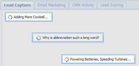
In the process of looking for efficient, modestly priced marketing automation tools, I recently checked out LoopFuse. One thing that got my attention was the little messages LoopFuse spits out while it’s “thinking” — or calculating — or whatever you want to call it.

Instead of “working” or “loading,” the little dialog box would read “calculating the square root of -1” or some other quip.

Again, it was refreshing to see a company that doesn’t take itself too seriously, even as they sell marketing automation services, which is among the most academic of acronyms in the already-ultra-geeky online marketing space.

You see, the trouble is, we interact with machines almost as much as we interact with humans, and in some cases far more. If you’re a consultant like me and you work out of your home or from various San Francisco coffee shops, it’s possible that talking to a marketing automation platform (MAP) doesn’t satisfy your need for real and meaningful interaction.

I’m not saying I don’t love marketing automation — we all know I love it with great gusto and MAPs are as American as cherry pie — but a little humor helps grease the gears of cognition a bit, you see.

3) CD Baby

You might’ve heard about the “CD Baby private jet” before. In short, the founder of CD Baby spun together this clever little confirmation email. At the time, perhaps he was just trying to avoid sending “ye olde boring confirm email” that we’ve all seen and ignored so many times — but what resulted was more than 20,000 references to the thing, many of which yielded some nice SEO backlink juice to the site.

Nice work, Derek. I salute your refusal to be boring.

Here was the email:

Your CDs have been gently taken from our CD Baby shelves with sterilized contamination-free gloves and placed onto a satin pillow. A team of 50 employees inspected your CDs and polished them to make sure they were in the best possible condition before mailing.

Our packing specialist from Japan lit a candle and a hush fell over the crowd as he put your CDs into the finest gold-lined box that money can buy.

We all had a wonderful celebration afterwards and the whole party marched down the street to the post office where the entire town of Portland waved ‘Bon Voyage!’ to your package, on its way to you, in our private CD Baby jet on this day, Sunday, December 11th.

I hope you had a wonderful time shopping at CD Baby. We sure did. Your picture is on our wall as “Customer of the Year”. We’re all exhausted but can’t wait for you to come back to CDBABY.COM!!

Thank you once again,


Derek Sivers, president, CD Baby

4) E*TRADE

Believe it or not, once upon a time, even these guys got in on the fun. Remember that one E*TRADE Super Bowl commercial from oh-so-long-ago?


We just wasted $2,000,000. What are you doing with your money?

When it’s brand recognition you’re trying to build, humor is maybe the best tool in the shed.

Look, there’s a time and a place for being serious. All I’m saying is this: companies who can take a joke, who aren’t afraid to be playful, and who communicate with the world in a direct, friendly, easygoing voice are often companies that earn my trust more readily than the Anthem Blue Cross’s and Comcasts of the world (sorry Anthem, but you suck).

Does your company appreciate humor? Talk to us; we want to know how.


...Read less

Comments Off on 4 companies that don’t take themselves too seriously, and why that’s awesome

Let’s compare email marketing services, shall we?

July 19, 2011

apples to applesHaving worked with a number of email marketing solutions, we thought it appropriate to put together an informal email marketing service roundup.

Let’s start with the bottom line: at Clever Zebo, we’re all about MailChimp as the easiest, most user-friendly email marketing tool when comparing apples to apples.


Constant Contact review

A classic, well-known email marketing solution, Constant ContactRead more…

apples to applesHaving worked with a number of email marketing solutions, we thought it appropriate to put together an informal email marketing service roundup.

Let’s start with the bottom line: at Clever Zebo, we’re all about MailChimp as the easiest, most user-friendly email marketing tool when comparing apples to apples.


Constant Contact review

A classic, well-known email marketing solution, Constant Contact is very friendly to business owners but leaves something to be desired if you’re a veteran email marketer. Still, I’d rate it well overall and would recommend it to an email marketing novice because of its easy setup and modest pricing — you can always                                                  graduate to a more complex email marketing solution.

What we love:

  • Easy to navigate, upload lists and craft emails
  • Free trial with no credit card required
  • Decent number of templates to choose from
  • Solid customer support
  • The email creation interface’s draggable, editable windows are a nice touch.

What we don’t love:

  • Free trial only allows you 100 contacts, so you can’t gather any meaningful data from a test email campaign
  • No good built-in mechanism for A/B testing
  • Editing and formatting is finicky
  • We should be able to copy and past editing WYSIWIG windows among different emails.


iContact review

iContact is, for the most part, painful to use. The user interface is clunky, very basic functionality, and preview doesn’t work correctly. We don’t recommend it.


MaxMail review

MaxMail is a decent tool, though there are some kinks to work out when it comes to the editing tools. What’s nice about it is the ability to do more than just send email blasts; you can create landing page lead forms, integrate with your social presence, etc.

We also love companies whose messaging is clear, sharp, gimmick-free and full of personality — and MaxMail does a nice job of talking to customers like they’re smart and capable.

What we love:

  • Friendly messaging
  • Sharp user-interface
  • Because they’re a Canadian company (not covered by CAN-SPAM), less stringent list restrictions allow for more prospecting freedom
  • Email automation functionality based on user behavior
  • By hour granular open/click reporting
  • Ambitious, passionate management team

What we don’t love:

  • Buggy editing tools make designing emails difficult
  • Only 4 pre-designed templates
  • Less-stringent list restrictions put their shared servers at much higher risk of deliverability issues
  • Pulling visual assets form a web page is not intuitive and the help functionality went to Not Found pages
  • No A/B testing function
  • 500 emails in the free trial is too few to get a good taste


MailChimp review

Mail Chimp is a winning email marketing solution. At the end of the day, their attention to excellent user experience, and maybe even more importantly, their avoidance of common UX pitfalls, make the application a pleasure to work with.

What we love:

  • Incredibly easy and user-friendly
  • Humor is part of the MailChimp experience
  • The free trial, which allows you up to 12,000 emails per month, allows for a truly valuable experience with the tool and inspires confidence in the offering
  • Analytics and tracking are integrated
  • Reports are simple, easy to read, and don’t require download
  • They have easy-to-use A/B testing

What we don’t love:

  • We’re all about clean email lists, but their super-stringent deliverability policies are a little too aggressive for businesses in the process of vetting a list
  • They’re not big on phone support, so you better be comfortable with email, chat, and Forums


ExactTarget review

Exact Target is an expert email platform for large-volume senders. You pay a premium for incredible deliverability and reputation, but it’s ultimately worth it.

What we love:

  • Designed for large-volume senders
  • Straight-forward interface provides you with the essentials but also allows for expansion such as API integration, automation rules, etc.
  • Incredible deliverability on shared servers
  • Knowledgeable, helpful deliverability team has the relationships and know-how to clean up snafus
  • A human being picks up the customer service line
  • Conversion tracking built in to reporting
  • Send metering
  • Extremely stable platform

What we don’t love:

  • No automated A/B testing functionality
  • Specialists are helpful when they get on the phone, but it’s a big company, and they can be hard to track down
  • While they are trying to build out a lot of advanced functionality, the platform wasn’t designed to encompass the full suite of marketing automation, so they’re somewhere in the middle.


Marketo review

Generally, Marketo is labeled as a marketing automation solution, but email is a core component. As we have a bunch of experience with Marketo, we felt it was important to write up.

What we love:

  • Awesome email automation functionality made simple by an intuitive user interface
  • Super-deep reporting
  • Full integration with SFDC
  • Solid customer support
  • A engaged user community helps drive product development and keep Marketo on its toes

What we don’t love:

  • The platform is made for tens not hundreds of thousands of database records. If you have a million people in your database, expect load wait times.
  • Marketo doesn’t fully support Salesforce.com custom objects, so beware.
  • It’s really expensive as an email solution unless you’re a high-volume sender.
  • They’re a fast-growing startup, and we encountered some technical issues. There are more stable email solution platforms out there, such as Exact Target.

Do you have experience with the email marketing solutions we mentioned, or comments on email tools we didn’t cover? Please tell us in the comments.

...Read less

Comments Off on Let’s compare email marketing services, shall we?

8 user experience gaffs that annoy your prospective customers

July 8, 2011

Picture this: you’ve got a prospect. Maybe hundreds or thousands, but let’s focus on just this one. She just landed on your website and there’s so much hope! She could create an account, sign up for your newsletter — maybe even become a paying customer.

But 9 times out of 10 for most websites, she won’t. She’s going to break up with your website over some tiny miscue before it even has a chance toRead more…

Read more...

Picture this: you’ve got a prospect. Maybe hundreds or thousands, but let’s focus on just this one. She just landed on your website and there’s so much hope! She could create an account, sign up for your newsletter — maybe even become a paying customer.

But 9 times out of 10 for most websites, she won’t. She’s going to break up with your website over some tiny miscue before it even has a chance to show her its many virtues.

If your site has a conversion rate north of 10%, I salute you (and I’d like to talk to you about joining our team) — but the reality is that most websites lose prospects for silly reasons, and their conversion funnel can be tightened. In this post, I want to explore a few of those reasons.

1. You’re making me sign up too early

Do I have to create an account, enter my email address, or give you the keys to my car in order to do stuff on your site? That’s cool, but whatever you’re offering better be good. Let me get something useful out of the site without signing up, or demonstrate value in a simple manner using pretty pictures, and you’ll win my loyalty.

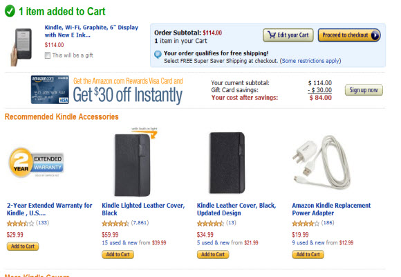
For example: go shop Amazon.com as a guest, without signing in. You can put that Kindle in your shopping cart, view its content and keep right on shopping. Only when you say “check please” (by clicking the Checkout button) are you asked to commit some information.

Be careful: when you demand account creation too early, most people just move on.

2. Your signup process is clunky

If I have to waste clicks during your signup process, your validation code is too eager to point out a mistake, you don’t tell me that your password field requires both letters AND numbers… we’re through. I’m sorry. It’s not you, it’s… your clunky signup form.

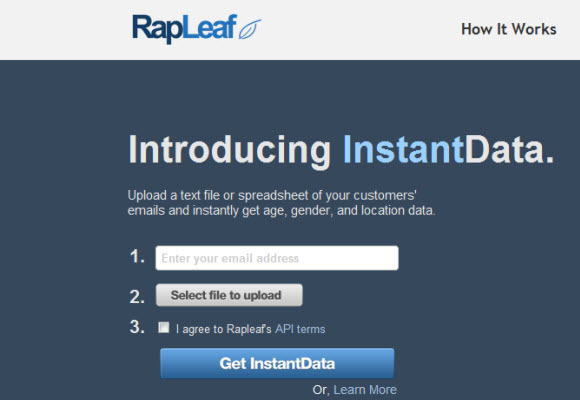
One site that’s done this very well is Rapleaf, who provides email list analytics tools. Look how clean their form below is. I can see off the bat what each step of the process involves – and even though this particular registration requires a file upload, which in some ways is a tall order with respect to registration – they’ve done a great job of being upfront with the user about what’s involved and what the reward will be.

rapleaf conversion funnel

3. Your site is buggy

If any part of the user experience makes me do a double-take within the first 30 seconds of my visit — we’re probably not going to be together much longer.

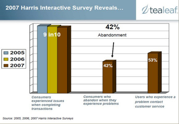
Roughly 87% of consumers conducting transactions online say they have experienced problems, and 42% of those have switched to a competitor or abandoned the transaction entirely, according to a Tealeaf survey conducted by Harris Interactive.

4. Something… anything… pops up

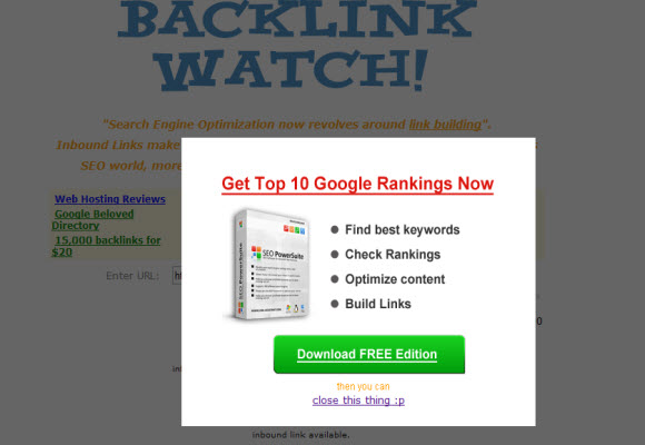
User testing shows that people hate pop-ups even when they’re not advertising. Even if they’re purportedly helpful or informative, users want to swat them away like a fly. So try another approach.

The example below comes from a site providing a free SEO tool that helps you see where your inbound links come from, so some degree of spammyness is perhaps to be expected.

popups suck

But this tip applies to non-advertising pop-ups, too. Some sites use a pop-up type format to give you “helpful tips” or usher you through the conversion funnel. Beware: you might get shut down before you get your message across. Pop-up swatters have an itchy trigger finger.

5. Your site has a flash intro

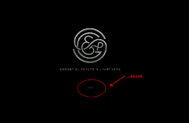
If I have to click “skip intro” before I can even see your content, I’ll probably do it — but you’ve burned up most of your credit with me on the first click. Was it worth it?

Some big-shot agencies love this, and granted, the agency below whom I’ve knocked for having a flash intro actually has a pretty awesome site. But I still say it’s a no-no for conversion-oriented pages.

goodby silverstein flash intro

6. It takes me more than 5 seconds to find your email address or phone number

If I really want to talk to your support people, by Jove, I’ll find it. But I ain’t gonna be happy about it. Difficult-to-locate contact information is the stepping stone to poor customer service.

One of many companies who’ve done this well is Legalzoom, which gives users its customer service phone number and a Contact Us link on every single page of the website.

7. Your web form is forgetful

You should use validation sparingly and be friendly about it — but if you have to send me back to square one — please, for the love of Santa, don’t lose any of my work.

8. Your stock photography sucks

Face the facts: most stock photos don’t look good. Yes, some studies show that pictures of real people drive better conversion rates, but if you’re going to use iStockPhoto or a similar site, make sure you at least choose photos of people who look real. The chick with the laptop and two victorious fists in the air ain’t foolin’ nobody.

Can you sense the difference between the awful stock photo below, used by a top-ranking concierge service website:

bad stock photography

And the photo below, which features someone who looks – save for the big cheesy stock photo grin – like a real person?

better stock photography

When it comes to site design, there are countless little things that factor into whether visitors will stick around or bounce. The overarching rules of thumb, though, are pretty intuitive: keep it simple, treat people like they’re smart, play nice, demonstrate value before you ask for commitments and wait on the user hand and foot. You’ll be rewarded with signups, purchases and friendly reviews.

Lots of sites are doing a fantastic job designing the initial steps of their conversion funnel: as I’ve mentioned before, Tumblr, Squarespace and Smarterer are a couple of my personal favorites. Weebly is great at it, too.

What are your favorites?

...Read less

Comments Off on 8 user experience gaffs that annoy your prospective customers