A blog about smart marketing and conversion optimization.

8 user experience gaffs that annoy your prospective customers

Picture this: you’ve got a prospect. Maybe hundreds or thousands, but let’s focus on just this one. She just landed on your website and there’s so much hope! She could create an account, sign up for your newsletter — maybe even become a paying customer.

But 9 times out of 10 for most websites, she won’t. She’s going to break up with your website over some tiny miscue before it even has a chance toRead more…

Continue reading >

Picture this: you’ve got a prospect. Maybe hundreds or thousands, but let’s focus on just this one. She just landed on your website and there’s so much hope! She could create an account, sign up for your newsletter — maybe even become a paying customer.

But 9 times out of 10 for most websites, she won’t. She’s going to break up with your website over some tiny miscue before it even has a chance to show her its many virtues.

If your site has a conversion rate north of 10%, I salute you (and I’d like to talk to you about joining our team) — but the reality is that most websites lose prospects for silly reasons, and their conversion funnel can be tightened. In this post, I want to explore a few of those reasons.

1. You’re making me sign up too early

Do I have to create an account, enter my email address, or give you the keys to my car in order to do stuff on your site? That’s cool, but whatever you’re offering better be good. Let me get something useful out of the site without signing up, or demonstrate value in a simple manner using pretty pictures, and you’ll win my loyalty.

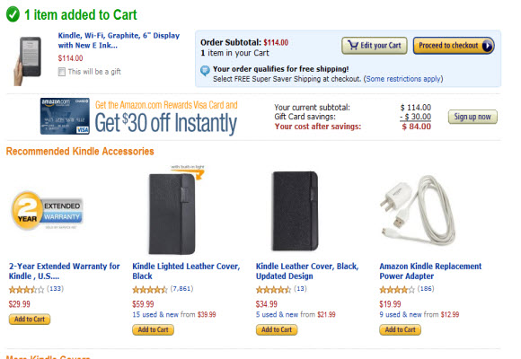
For example: go shop Amazon.com as a guest, without signing in. You can put that Kindle in your shopping cart, view its content and keep right on shopping. Only when you say “check please” (by clicking the Checkout button) are you asked to commit some information.

Be careful: when you demand account creation too early, most people just move on.

2. Your signup process is clunky

If I have to waste clicks during your signup process, your validation code is too eager to point out a mistake, you don’t tell me that your password field requires both letters AND numbers… we’re through. I’m sorry. It’s not you, it’s… your clunky signup form.

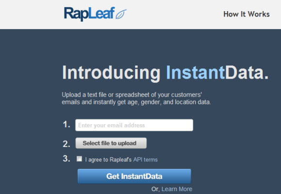
One site that’s done this very well is Rapleaf, who provides email list analytics tools. Look how clean their form below is. I can see off the bat what each step of the process involves – and even though this particular registration requires a file upload, which in some ways is a tall order with respect to registration – they’ve done a great job of being upfront with the user about what’s involved and what the reward will be.

rapleaf conversion funnel

3. Your site is buggy

If any part of the user experience makes me do a double-take within the first 30 seconds of my visit — we’re probably not going to be together much longer.

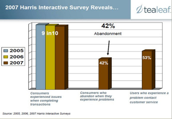
Roughly 87% of consumers conducting transactions online say they have experienced problems, and 42% of those have switched to a competitor or abandoned the transaction entirely, according to a Tealeaf survey conducted by Harris Interactive.

4. Something… anything… pops up

User testing shows that people hate pop-ups even when they’re not advertising. Even if they’re purportedly helpful or informative, users want to swat them away like a fly. So try another approach.

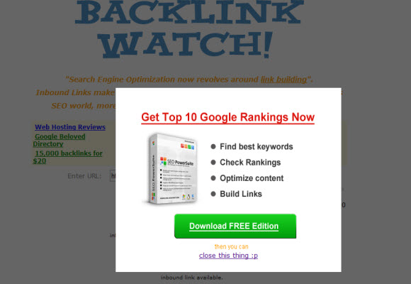
The example below comes from a site providing a free SEO tool that helps you see where your inbound links come from, so some degree of spammyness is perhaps to be expected.

popups suck

But this tip applies to non-advertising pop-ups, too. Some sites use a pop-up type format to give you “helpful tips” or usher you through the conversion funnel. Beware: you might get shut down before you get your message across. Pop-up swatters have an itchy trigger finger.

5. Your site has a flash intro

If I have to click “skip intro” before I can even see your content, I’ll probably do it — but you’ve burned up most of your credit with me on the first click. Was it worth it?

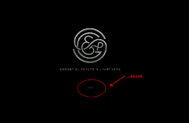
Some big-shot agencies love this, and granted, the agency below whom I’ve knocked for having a flash intro actually has a pretty awesome site. But I still say it’s a no-no for conversion-oriented pages.

goodby silverstein flash intro

6. It takes me more than 5 seconds to find your email address or phone number

If I really want to talk to your support people, by Jove, I’ll find it. But I ain’t gonna be happy about it. Difficult-to-locate contact information is the stepping stone to poor customer service.

One of many companies who’ve done this well is Legalzoom, which gives users its customer service phone number and a Contact Us link on every single page of the website.

7. Your web form is forgetful

You should use validation sparingly and be friendly about it — but if you have to send me back to square one — please, for the love of Santa, don’t lose any of my work.

8. Your stock photography sucks

Face the facts: most stock photos don’t look good. Yes, some studies show that pictures of real people drive better conversion rates, but if you’re going to use iStockPhoto or a similar site, make sure you at least choose photos of people who look real. The chick with the laptop and two victorious fists in the air ain’t foolin’ nobody.

Can you sense the difference between the awful stock photo below, used by a top-ranking concierge service website:

bad stock photography

And the photo below, which features someone who looks – save for the big cheesy stock photo grin – like a real person?

better stock photography

When it comes to site design, there are countless little things that factor into whether visitors will stick around or bounce. The overarching rules of thumb, though, are pretty intuitive: keep it simple, treat people like they’re smart, play nice, demonstrate value before you ask for commitments and wait on the user hand and foot. You’ll be rewarded with signups, purchases and friendly reviews.

Lots of sites are doing a fantastic job designing the initial steps of their conversion funnel: as I’ve mentioned before, Tumblr, Squarespace and Smarterer are a couple of my personal favorites. Weebly is great at it, too.

What are your favorites?

...Read less
Grow your online reputation using your clients’ feedback

This is guest post written by Luana Spinetti, author of N0tseo.com.

Growing your business reputation online is a work of patience. Your campaigns bring in a slow, indisputable long-term results. SEO is all about action and waiting, optimization and rank advance to a better position. But sometimes building backlinks and a mild social presence is not enough to take that step forward and really improve your website rankings. If you’re looking for more naturalRead more…

Continue reading >

This is guest post written by Luana Spinetti, author of N0tseo.com.

Growing your business reputation online is a work of patience. Your campaigns bring in a slow, indisputable long-term results. SEO is all about action and waiting, optimization and rank advance to a better position. But sometimes building backlinks and a mild social presence is not enough to take that step forward and really improve your website rankings. If you’re looking for more natural one-way links to boost your business’ authority, the key is your satisfied clients.

Testimonials

Ask your clients to leave a testimonial on your feedback page. This action won’t bring immediate backlinks, but it prepares the grounds for your clients’ happiness: knowing their feedback is relevant to you will encourage them to not only say thank you, but to write about their feelings and to grow an attachment to your brand. This is not only good data to use for product/service improvement, but also the first step to obtain natural links. A happy customer who feels like they’re important to you is more likely to link back to your company’s site and to spread the good word about it.

Social media rating

Your clients may rate your business on social media if they feel satisfied. Encourage them to do so by sending them satisfaction surveys and ‘thank you’ emails complete with your business social media accounts. They will feel thankful and do something in return because they feel they are important to you.

You can and should also engage in social conversations with your clients through social media. Human beings are social creatures, they enjoy interaction, on both a personal and a professional level. Taking the time to reply to each of them will boost your credibility and seriousness as a business. This is especially important when it’s your returning customers who seek interaction.

Freebies for backlinks

Another proven method is offering your clients a package of freebies in exchange of a mention and backlink to your business on their blogs or profile pages. If your business has a blog, this method will have multiple benefits, as it will increase both readership and number of returning customers.

Freebies may come in different shapes, but Internet users tend to prefer coupons, blog widgets, e-books and free dedicated services. Developing interesting freebies may require additional time and effort, but that is no waste, since the returning benefits are way greater than the expense. Remember that freebies get linked not just by your customers on their blogs, but their friends will too. Freebies are viral in nature and their power is a proven, since they don’t carry the “spam” label and are thus a safe technique.

How to encourage natural linking

Until now we reviewed three methods to “push” customers to link back to your business, but this last paragraph intends to give advice on the proper way to encourage natural backlinks, as they are the most genuine type of links, and you know the search engines love all things genuine.

I call it the “proper way” because eagerness to get natural links may wind up looking like spam. Encouraging natural backlinks implies little steps, kind interaction to your clients, and attention to their needs. I said this already, but I’m going to repeat it: your clients need to feel loved and appreciated. This is the only “proper” way to do it: people link back to others when they feel there is a relationship and they have an important role in it. They will never link back to a business that’s deaf to their feedback.

Keep these social dynamics in mind, and your business is on the road to backlink success.


...Read less

5 best practices for effective, high-converting lead forms

When it comes to your site’s lead form, the little things count. Here are a few ways to get it right.

1. Be minimalist. Ask for as little information as you can without rendering the lead useless. Use as few fields as possible. Are “company name” and “website” both essential for your form? Whittle it down to the essentials.

2. Make it stupidly easy to submit. Have a big, juicy, colorful call to action that’s justRead more…

Continue reading >

When it comes to your site’s lead form, the little things count. Here are a few ways to get it right.

1. Be minimalist. Ask for as little information as you can without rendering the lead useless. Use as few fields as possible. Are “company name” and “website” both essential for your form? Whittle it down to the essentials.

2. Make it stupidly easy to submit. Have a big, juicy, colorful call to action that’s just waiting to be clicked.

3. Don’t validate with an iron fist. If you must ask the user to re-submit or fix part of their entry, make it painfully obvious what they did wrong, and use plain English. Never use the word “error.” And always highlight all the issues the first time through. Nothing is more infuriating than fixing one problem only to be stalled by another.

4. Have a clear next step. I see a lot of sites that simply reload the blank form once it’s been submitted. Don’t do this. Create a satisfying experience by telling your user their message is on its way, and give them something to do in the meantime (e.g. check out our FAQs; visit our blog; to reach us faster, call 1-800-PEANUTS). You get the idea.

5. Double-check your tab order. Can I tab through the fields easily, and hit ‘Enter’ at the end to send? Make sure your tab order works smoothly to avoid frustrating some users.

In my opinion, Squarespace has a killer sign-up form. Tumblr does a great job, too.

What are the best lead forms you’ve seen?

...Read less